 So many times the packaging can make or break a toy. Look at the packaging for the first atari games, each box had
a detailed and colorful painting to represent a few blocks on the screen and G.I. Joe was no
exception when it came to packaging. The painting of the figure on the card gave life to the piece of plastic sealed
beneath the plastic bubble. The paintings made the figures look heroic and strong, but what
happened to the painting of Sneak Peak? He's supposed to be tough and phisically fit but the
painting shows a chubby faced, rosey cheeked, 'i'm in the wrong toy line' look. That face gets me
every time, and also notice the double chin, this guy ain't no G.I. Joe!
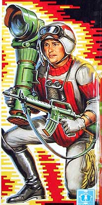
So many times the packaging can make or break a toy. Look at the packaging for the first atari games, each box had
a detailed and colorful painting to represent a few blocks on the screen and G.I. Joe was no
exception when it came to packaging. The painting of the figure on the card gave life to the piece of plastic sealed
beneath the plastic bubble. The paintings made the figures look heroic and strong, but what
happened to the painting of Sneak Peak? He's supposed to be tough and phisically fit but the
painting shows a chubby faced, rosey cheeked, 'i'm in the wrong toy line' look. That face gets me
every time, and also notice the double chin, this guy ain't no G.I. Joe!
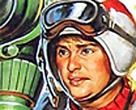
If you look hard enough
he kind of looks like Bea Aurther from the golden girls. 
And lets not forget about these guys...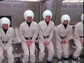
Am i the only who thinks their helmets are similar? Both sharing the same quality: Rediculous.
back to top